In brief
There are no colours you “cannot” wear, only combinations of colour, depth and finish that feel more or less natural on you. Start by noticing what you already feel good in, test colours by holding them near your face in daylight, and then let the occasion choose the mood: brighter by day, deeper in the evening, quieter for traditional ceremonies.
Colour advice is often delivered as rules: “autumn skin should wear rust”, “cool undertones suit blue”. Rules like these can be helpful starting points, but real skin is more varied than any chart, and most people look good in more colours than they were told. The honest approach is to treat colour as an experiment that you can run in front of a mirror.
This guide is a practical way to run that experiment, then to match colour to the occasion, without turning it into a formula.
Step 1: Look for a pattern in your own wardrobe
Pull out the five garments that always bring compliments, or that you reach for when you want to feel your best. Lay them next to each other. Is there a pattern? Perhaps they are all deep and rich, or soft and muted, or high-contrast. That pattern says more about you than a theory will.
Step 2: Test colours in daylight
Stand near a window in natural light, with a plain face if possible. Hold a garment or fabric under your chin. Look for these signals.
- Good sign: your face looks rested, your eyes seem brighter and the colour feels like it belongs with your skin.
- Poor sign: shadows seem deeper, skin looks tired or sallow, or the colour is the first thing you see rather than you.
Test both pale and saturated versions of a colour. Often the issue is not the hue but the depth: a softer blue might sing while a bright one overwhelms, or the reverse.
A few useful concepts
| Concept | What it means | Practical use |
|---|---|---|
| Undertone | The warm, cool or neutral note beneath the skin’s surface | Compare gold and silver jewellery; see which looks more natural |
| Contrast | The difference between your skin, hair and eye colour | High contrast often suits bolder combinations; lower contrast often suits tonal looks |
| Depth | How light or dark your colouring is overall | Choose colours of a similar depth for harmony, or contrast for drama |
| Saturation | How vivid a colour is | Muted tones calm; saturated tones energise |
None of this is absolute. Think of these as questions to ask, not labels to wear.
Step 3: Match the occasion
The same colour can feel very different depending on where you wear it.
Daytime and outdoors
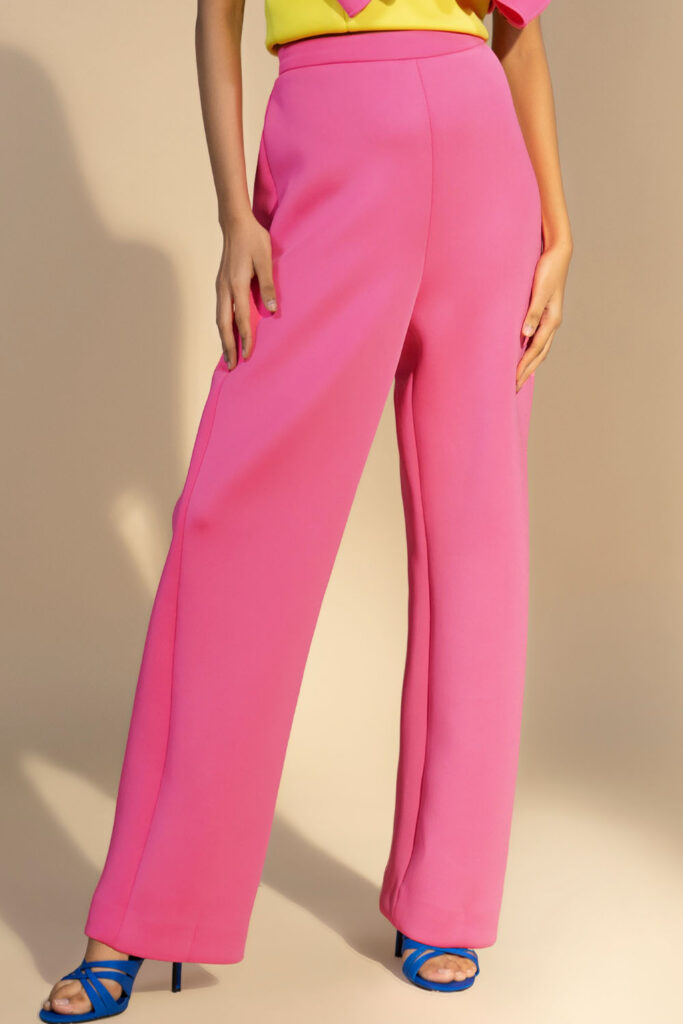
Natural light is forgiving to soft, clear colours: pastels, greens, butter yellows, sky blues. It can also be harsh on very bright shades, so if you love brights, choose a matte fabric. The Sunkissed Horizon palette is a useful reference for daytime colour.
Evening and indoors
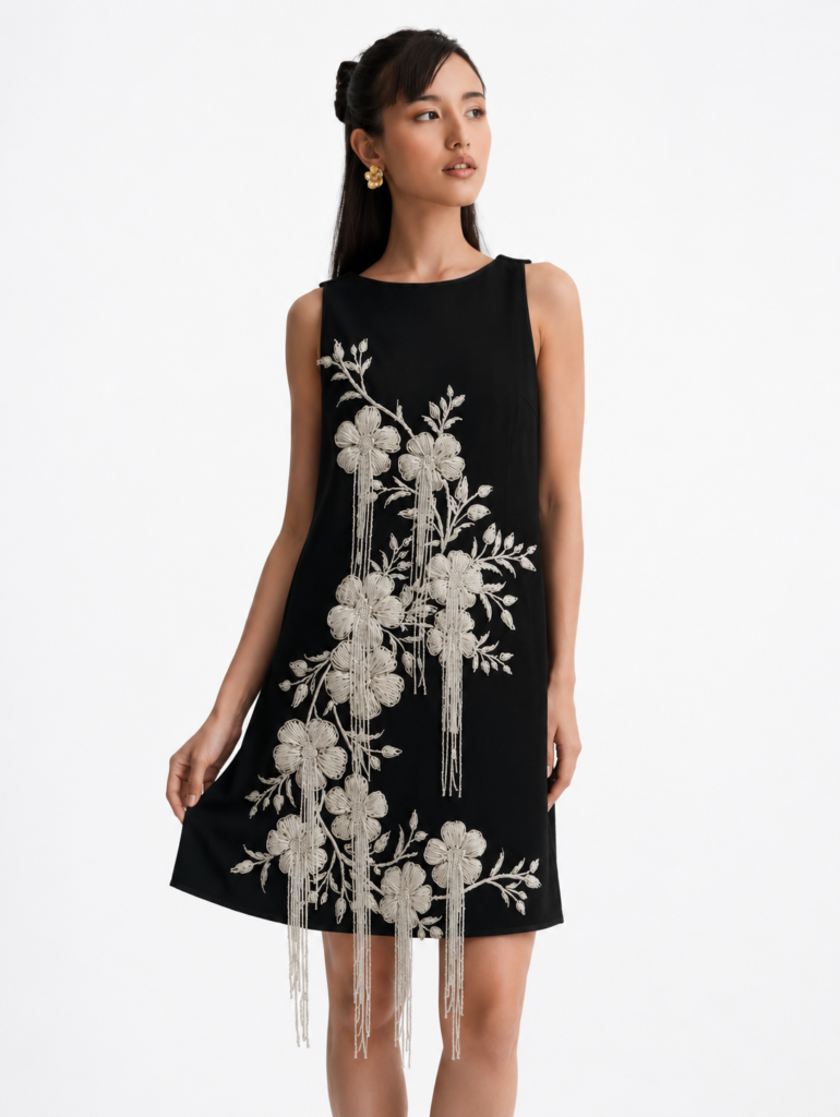
Warm, low light deepens colour and softens contrast. Jewel tones such as emerald, sapphire and plum look rich, and black and midnight shades look sleek. Metallic and embellished surfaces come alive after dark. See what to wear to a cocktail party for evening ideas.
Traditional ceremonies
At many Indian weddings, colour carries meaning. Check the family’s expectations before choosing white, ivory, red or black. Our wedding guest guide goes through each event.
Work and daytime meetings
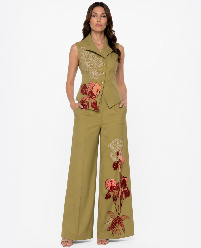
Muted, mid-depth colours read as confident without being loud: olive, navy, deep rose, camel. The olive in the Oliva Botanica Tailored Set is a good example of a colour that works across contexts.
Let the occasion choose the mood and your own colouring choose the depth.
Step 4: Build combinations that work
Colour combinations follow a few reliable patterns.
- Tonal: different shades of one colour, such as ivory, cream and sand. Calm and elegant.
- Neutral plus one accent: a black dress with a single red lip or bag.
- Analogous: neighbouring colours on the wheel, such as green with blue, or pink with coral. Harmonious and soft.
- Complementary: opposites on the wheel, such as blue and orange. Bold and energetic; use small amounts of one.
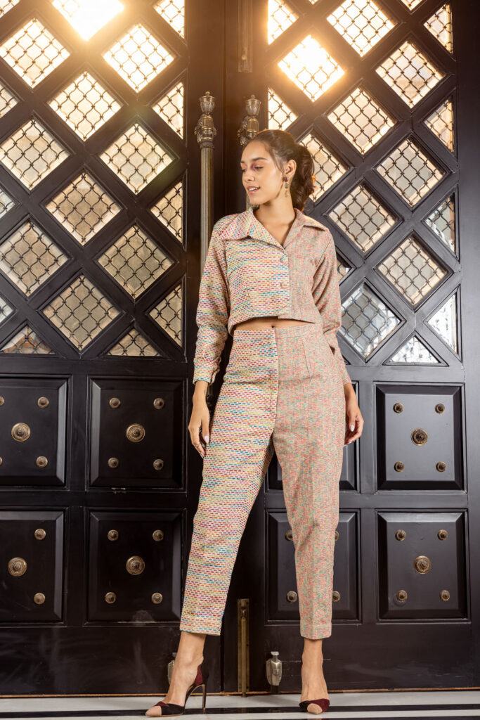
If a garment is already patterned, take one colour from the print and repeat it in an accessory. The pattern does the talking.
Step 5: Consider the accessories
Metals, shoes and bags affect colour as much as the garment. Gold tends to warm an outfit; silver cools it; rose gold sits in between. Neutral shoes in nude, black or metallic tones work with most outfits. If you wear a bold colour, choose shoes and bag from within the same family or from a quiet neutral.
Colour and photography
If photographs matter, remember that colours behave differently on camera. Very bright or neon shades can look flat, white can blow out under flash and black can lose detail. Mid-depth, saturated colours and matte fabrics tend to photograph reliably, though lighting varies.
Reading colours online
Screens differ, so a colour may look slightly different in person. Check the product description and the images, and look at several photographs of the same piece in different settings. If you are unsure whether a shade will suit you, message the team on WhatsApp before ordering, because garments are made to order and the store does not accept exchanges once an order is confirmed.
Quick palettes to borrow
| Mood | Palette | Good for |
|---|---|---|
| Quiet and polished | Ivory, sand, soft grey, one deep accent | Daytime, work, intimate dinners |
| Garden party | Sage, blush, butter yellow, white | Mehendi, brunch, resort days |
| After dark | Black, plum, emerald, metallic accents | Cocktail evenings, receptions |
| Celebration | Fuchsia, red, cobalt with neutral shoes | Sangeet, parties, festivals |
Use them as starting points and adjust according to your own colouring and taste.
When in doubt, choose depth over brightness
If you are unsure which shade will work, a mid-depth, slightly muted version of the colour is often the most forgiving choice. It tends to look rich in photographs, flatters a wide range of complexions and is easy to pair with neutral accessories. Save the very brightest shades for moments when you want to be the centre of attention, and then keep everything else simple.
Hair, make-up and colour
Your hair and make-up are part of the palette. A bold lip works best with a quieter dress, while a heavily coloured dress usually asks for a softer face. If you change your hair colour often, retest your favourite garment colours afterwards, since the balance near your face will have shifted.
Where to browse by colour mood
Browse dresses, co-ord sets or the Amaranth collection for a range of colours, from neutrals to brights.
Frequently asked questions
How do I find out if my undertone is warm or cool?
One simple test is to hold gold and silver jewellery near your face in daylight and see which looks more natural. It is a hint, not a rule, and many people suit both.
Can I wear black if it does not suit me?
Yes. Add a lighter colour or a bright accessory near your face, such as earrings or a scarf, to soften the contrast.
Which colours are safe for a wedding guest?
Jewel tones, pastels and rich neutrals are widely worn. Check family expectations about white, ivory, red and black before choosing.
What colours work best for daytime events?
Soft, clear colours such as greens, yellows, blues and blush tones generally look fresh in natural light, though personal colouring matters more than any rule.